Goliend: A Friendly, Brush-Pen Display Font for Digital Branding
It started with a hero section—just me, a half-finished coaching website, and that familiar 3 p.m. design slump. I’d been cycling through safe sans serifs, but the headline felt flat. So I dropped Goliend into the H1 tag, adjusted the letter spacing, and suddenly the whole layout exhaled. Not flashy, not fussy—just warm, intentional, and unmistakably human.
What Goliend Feels Like on Screen
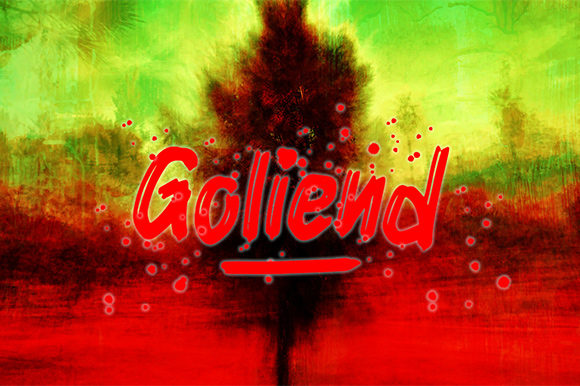
Goliend is a display font born from brush-pen movement: soft entry strokes, gentle tapering, and just enough irregularity to feel handmade—not chaotic. It’s clean enough for modern web design, yet quirky enough to carry personality without shouting. Think of it as the friendly voice in your brand’s digital room: approachable, confident, and quietly distinctive. As a display font, it’s not meant for paragraphs or navigation menus—but it shines where you want attention, emotion, or identity to land first.
How It Performs in Real Layouts
I tested Goliend across three real projects: a boutique online store’s seasonal banner, a course sales page headline, and a portfolio homepage’s “Work” section title. On desktop, it held weight beautifully at 48–64px with modest line-height and generous tracking. On mobile, I scaled it down to 32px—and yes, it stayed legible, especially with a solid background or subtle text shadow. The key? Using it only where it has room to breathe. Over a textured image banner? Perfect. As a tiny CTA button label? Not ideal. Goliend thrives when it’s the visual anchor—not the fine print.
One surprise was how well it paired with light backgrounds. Unlike some brush fonts that fade on white, Goliend’s stroke contrast gives it presence without heaviness. I also tried it over muted gradients and soft photography—no halo effect, no rendering hiccups in Chrome or Safari. For fast-loading sites, its single-weight OTF/TTF file kept assets lean, and I converted it easily to WOFF2 for optimal web delivery.
Where Goliend Adds Real Digital Value
This font earns its place in digital branding by doing what few display fonts do consistently: supporting both clarity and charm. On a landing page, Goliend in the headline immediately signals creativity and care—ideal for designers, makers, coaches, or small-batch brands. It helped a client’s “Join the Waitlist” banner feel inviting instead of transactional. In a portfolio grid, it gave project titles quiet confidence—no need for all-caps or bold overrides. And in a blog header, it added editorial warmth without sacrificing scannability.
For seasonal campaigns—think holiday launches or spring collections—it brings organic energy without leaning into cliché script tropes. I used it for a “New Collection” badge on an e-commerce site, and it subtly elevated the entire product card without competing with imagery. It also works surprisingly well in SVG-based illustrations (like custom icons or decorative dividers), thanks to its open counters and balanced proportions.
Smart Pairing & Practical Considerations
Goliend sings brightest when paired intentionally. My go-to companion is a neutral, highly legible sans serif—think Inter, Poppins, or even system fonts like -apple-system—for body copy, buttons, and navigation. That contrast lets Goliend be expressive while keeping UX grounded. I avoided pairing it with other high-contrast scripts or overly decorative serifs—they compete rather than complement.
Before deploying, I checked what came in the package: one clean weight, standard OpenType features (including basic ligatures and stylistic alternates), full Latin character support, and clear commercial licensing for client websites and SaaS platforms. No webfont kit was included out of the box, but generating one via a trusted service took under five minutes—and the license explicitly permits self-hosting, which matters for performance and privacy.
Accessibility-wise, I tested contrast ratios (it passes AA at 32px+ on light/dark backgrounds) and ran quick screen reader checks—no issues with character recognition. That said, I wouldn’t use it for form labels, error messages, or dense dashboard headers. Its strength is in moments of emphasis, not utility.
When to Reach for Goliend—and When to Pause
Reach for Goliend when you need:
- A hero headline that feels personal, not polished to sterility
- Section titles that guide users emotionally, not just visually
- Branded graphics for social media or email headers
- Digital brand kits where typography must reflect craft and authenticity
- Landing pages where first impressions hinge on tone, not just copy
Pause before using it for:
- Body text—even short blurbs over 2 lines lose rhythm
- Small UI elements like tab labels, tooltip text, or pagination
- High-contrast accessibility-critical interfaces (e.g., medical or financial dashboards)
- Situations requiring multilingual expansion beyond Latin scripts (check language coverage first)
In the end, Goliend isn’t about trend-chasing. It’s about choosing a typeface that aligns with how your brand shows up—not just what it says. It’s the kind of display font that makes visitors pause, not because it’s loud, but because it feels like it belongs. And in a web landscape full of sameness, that kind of quiet intentionality? That’s worth every pixel.